

Responsive home configuration web application.
Ideation // UI/UX // Prototyping // Front-end HTML & CSS
The What
Web-based, fully mobile-responsive, and interactive configuration tool for new construction residential home buyers and builders alike. All was created within an Agile development workflow. It's a mouthful for sure.
The "No-Brainers"
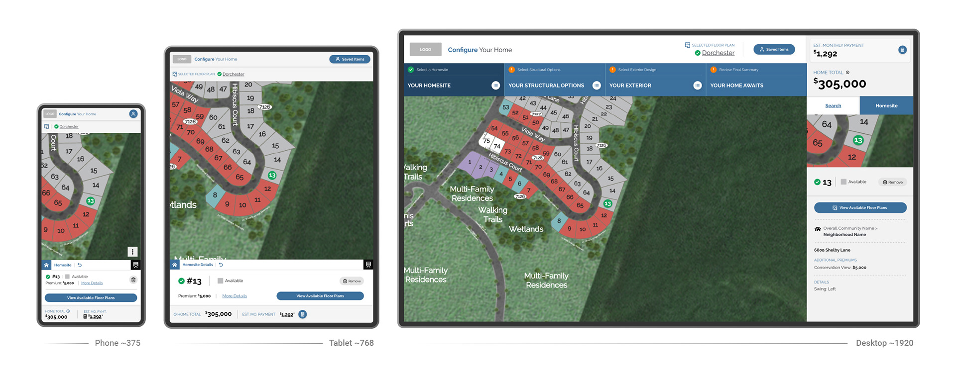
Yes, I know that mobile portrait first (with mostly bottom navigation) is a "no-brainer", but sticking to a very limited and thoughtful color strategy was also vital. As most of us know, complex UX and heavy UI demands it. Also adhering to the principle of "giving the user as many ways as possible" to navigate and make changes screams at you while creating something this complex.
I'm sorry, but I have to ruin my attempt at a clever one (or four) liner here to provide additional context. This project was a bear to ideate into a singular application, let alone one that provides solid UX on mobile while having nothing like it to reference and compare against. For a project of this size and uniqueness, UX architecture demanded a lot of time and focus while constantly juggling usability best practices every step of the way.
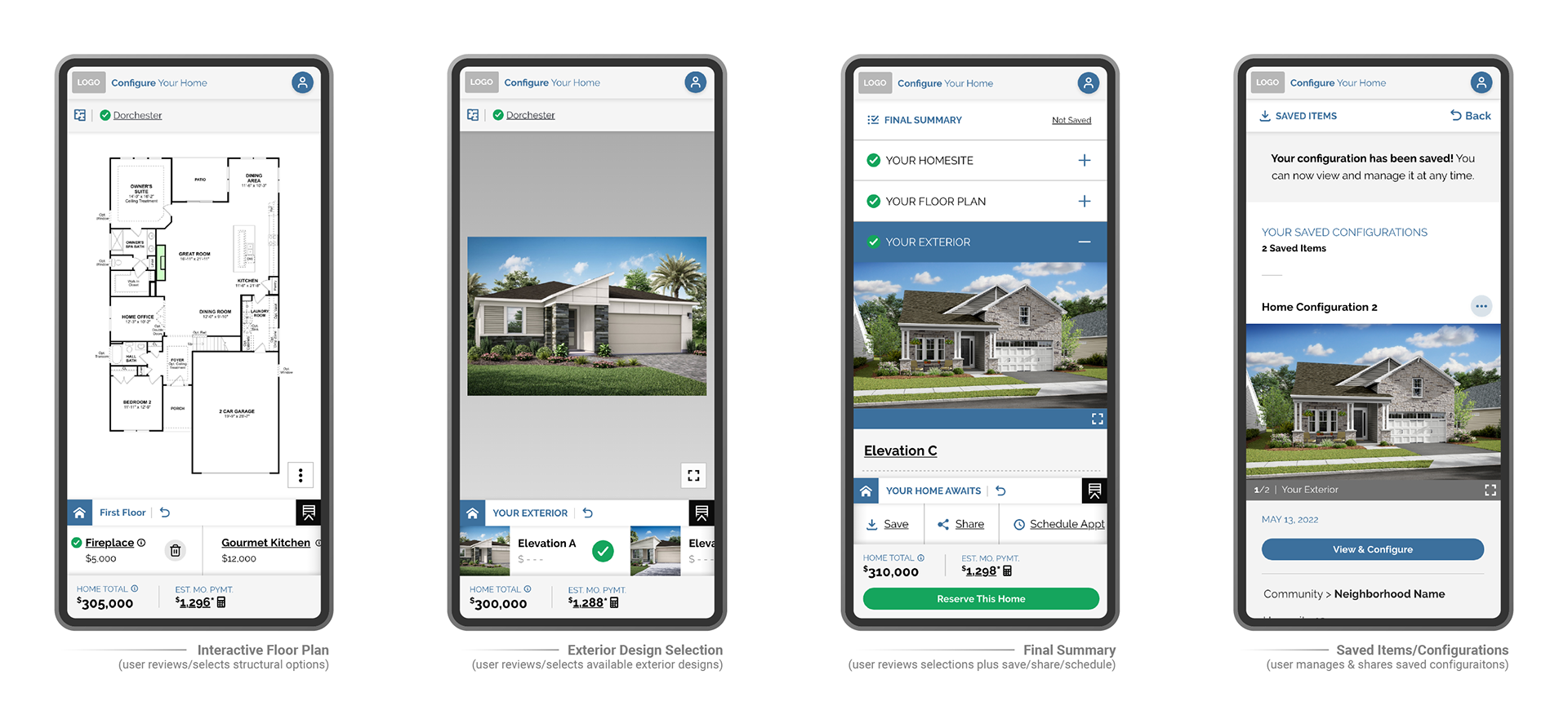
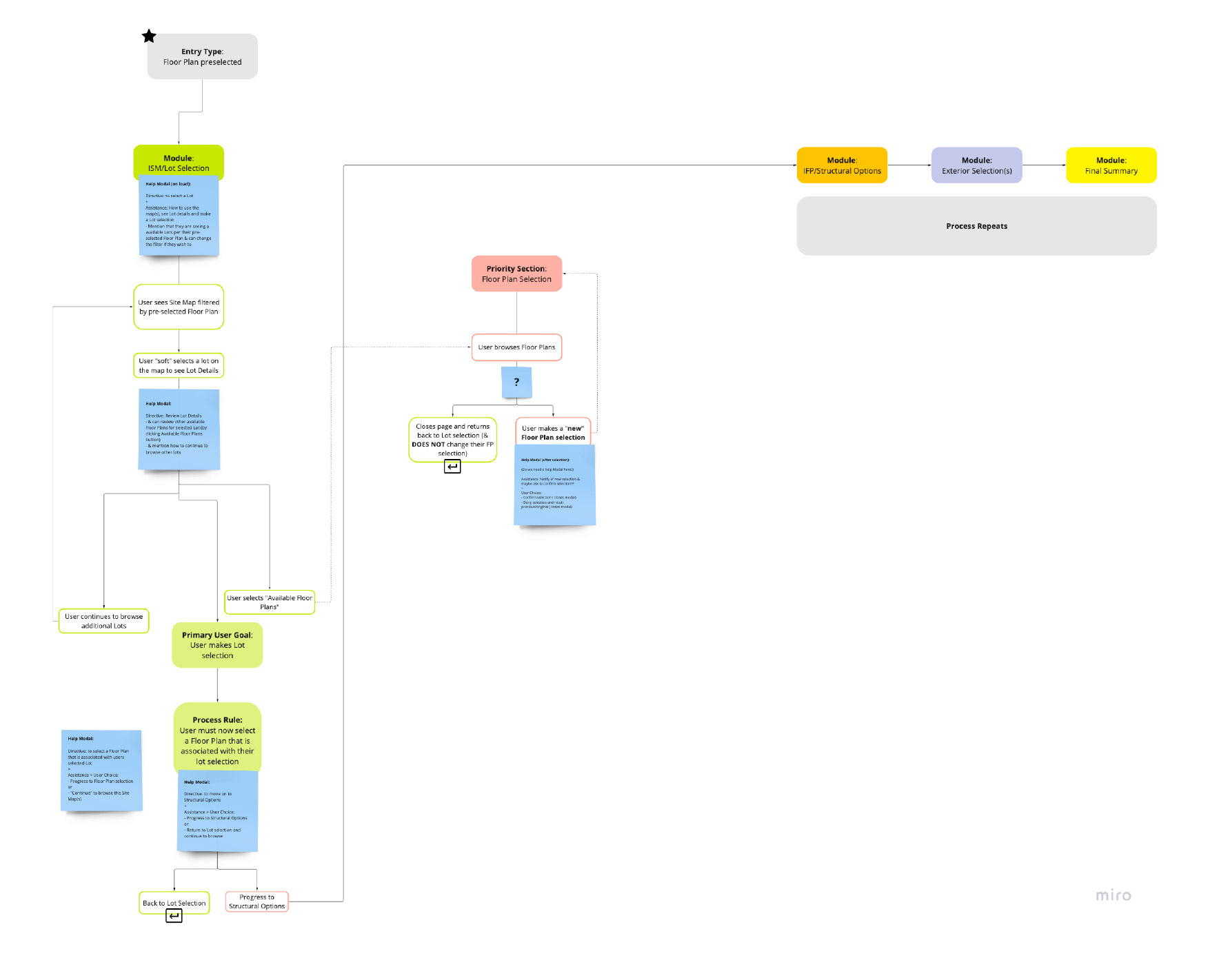
Something that isn't very apparent in my examples is that this application was also designed to allow for multiple avenues of entry from the builder's websites. They will have the ability to allow users to "enter" with nothing selected and/or a homesite or floor plan pre-selected. Some of this is covered in the flow charts below.
The Problems
This one is easy because there isn’t anything out there in the “web ether” like it. Home buyers have decent online/web tools to assist them on their home-buying journeys, but we are only talking about buying existing/"used” homes. However, shopping for and buying new construction homes often requires buyers to exert additional mental and physical work along the way. Home-buying apps (like Zillow) don’t offer much new construction information. Builder websites offer more but still struggle to put the new construction puzzle together, while very few buyers understand that builders plan out new communities in a very detailed way. For example, planned communities assign specific floor plans to every lot/home site. This means that not every floor plan the buyer sees (in a given community) is available on every lot/home site. I could go on and on here, but you get the picture.
The Why
For home buyers/end-users, it’s about removing the confusion and increasing buyer knowledge of the builder/new-home construction space, and having the ability to save, and share configurations that have current data. In other words, the buyers will know which home sites and floor plans are still available while using the application. Builders on the other hand are able to offer this complete and consolidated solution to their potential buyers right from their websites. The existing builder clients get the added benefit of utilizing existing services and products and get a huge jump in the process since the configurator leverages existing product data on existing stand-alone applications and presentations.
On the in-house business side, a new commitment to mobile-friendly products, shortening development time, and a brand-consistent business model helped this effort make sense for both sides (the business and their clients/end-users). The reduction of in-house and client development costs is to be achieved by utilizing/combining existing products while including maximum content management integration from the start.
The mobile responsive nature of this design was a must so it functions seamlessly into responsive builder websites. This application also offers the ability to be used completely inline as an iFrame or launched in a new browser window/tab (to offer a more preferred and immersive, full-screen experience). I pushed hard for the "new tab" version because inline iFrames are a major pain when it comes to user experience. The more complex the content, the less likely it should be crammed into an inline experience.
Finally, maximum Integration into a proprietary CMS (Content Management System) was also a priority. Some of the integrated components include UI, color, branding colors, configurable options, pricing, and pre-configured products (just to name a few). The CMS is accessible to both internal employees and external clients, thus making changes to the application quick, easy, and more cost-effective for everyone involved. Oh, and did I mention I designed that too?
Insights, Research, and Instinct
Insights and Business Opportunities:
The realistic dream is to use this tool to buy a house online. We knew that’s a little ways off, but in the meantime, the configurator can and will be used to garner buyer loyalty and assist with on-site sales, and eventually replace older sales center presentations. This product can and will be used for:
The realistic dream is to use this tool to buy a house online. We knew that’s a little ways off, but in the meantime, the configurator can and will be used to garner buyer loyalty and assist with on-site sales, and eventually replace older sales center presentations. This product can and will be used for:
1. eCommerce (from lot/home site reservations to full home purchase)
2. Customizable product visualization
3. Can work seamlessly with the popular “Pre-configured” and “Move-in Ready” builder business models
4. Sales (focusing on replacing older sales center presentations)
5. Gain valuable insights and data into customer preferences
6. Empower buyers by offering more insider insight and education into the new home construction buying “world”
7. Increase customer satisfaction (of course)
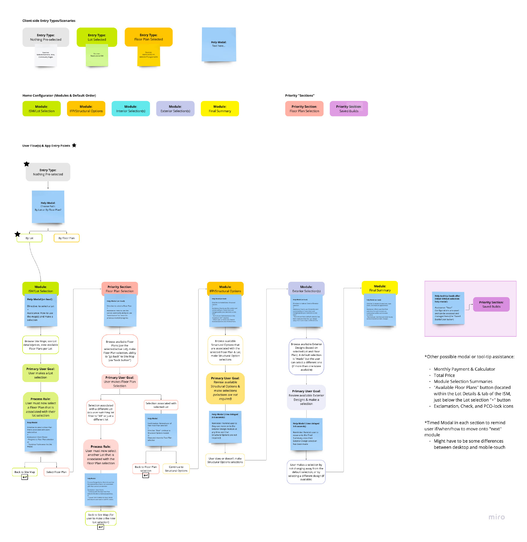
Miro board- User Flow: Chart legend and "nothing pre-selected" entry point

Miro board - User Flow: Floor plan pre-selected entry point
Miro board - User Flow: Lot/homesite pre-selected entry point
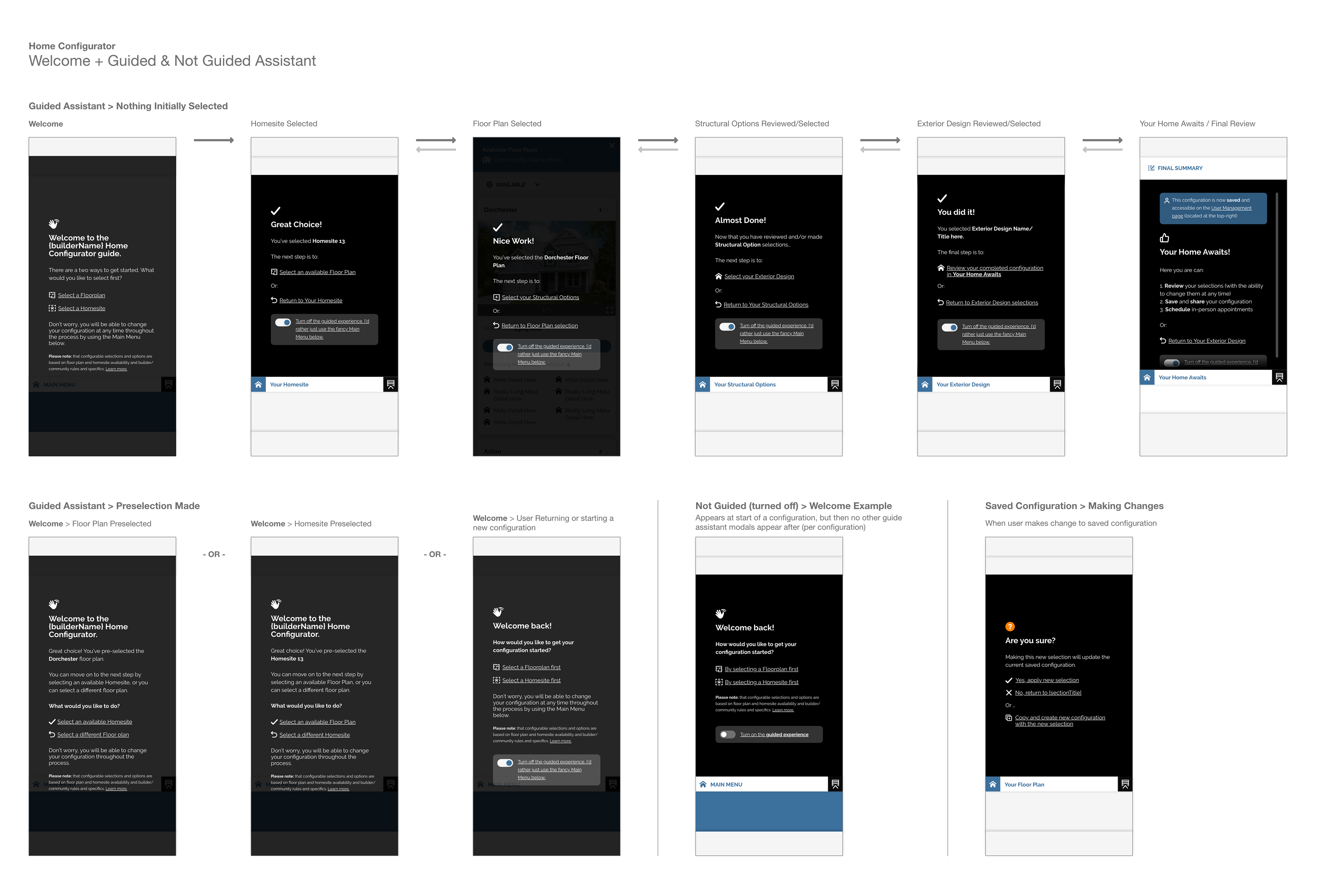
User Assistance: Guided (mobile phone)
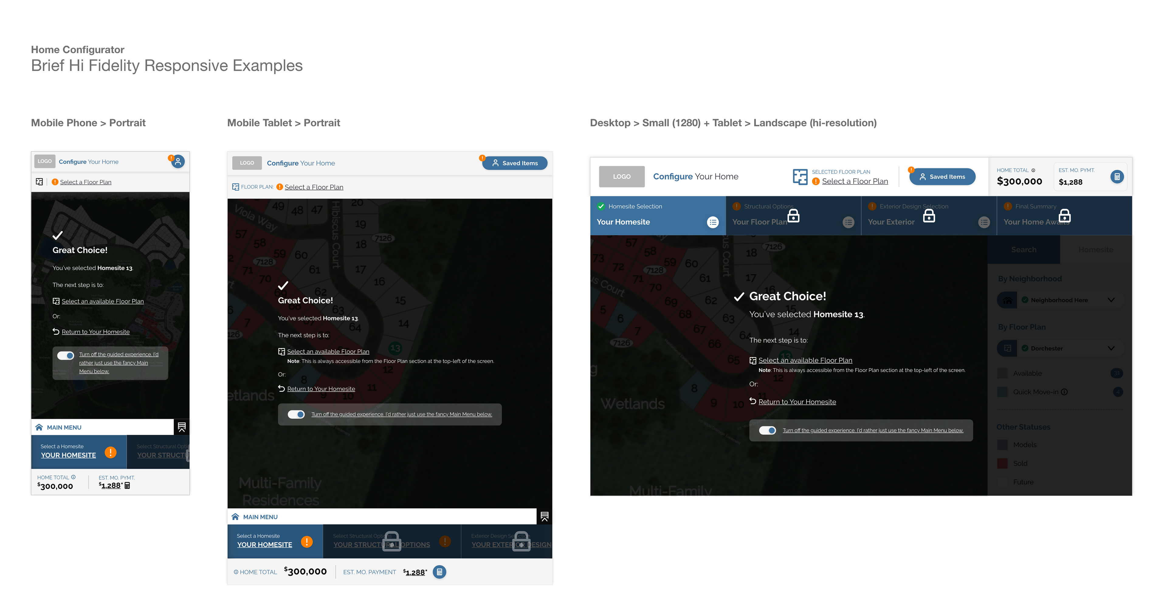
User Guided Assistance (responsive preview/example)
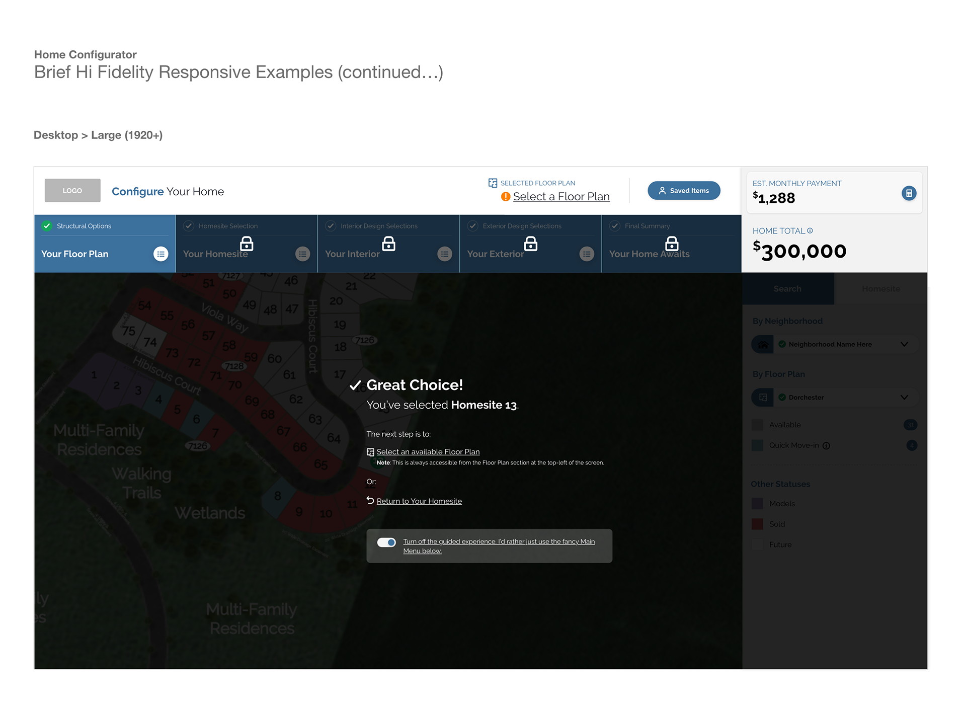
User Guided Assistance (responsive preview/example - desktop large/1920)
Research and Preferences:
Let's be honest, there isn't any existing usable data and research on buying a new construction home online, let alone how to do it and what type of user experience should be sewn into it. With that said, we had to go with our instincts while relying on modern product development techniques (like "jobs to be done" and "mom testing"). Plus we had some solid insider builder information directly from big builders like Mattamy Homes and Century Communities which was priceless for sure.
Let's be honest, there isn't any existing usable data and research on buying a new construction home online, let alone how to do it and what type of user experience should be sewn into it. With that said, we had to go with our instincts while relying on modern product development techniques (like "jobs to be done" and "mom testing"). Plus we had some solid insider builder information directly from big builders like Mattamy Homes and Century Communities which was priceless for sure.
The company's long history and relationships within the home builder space (it pretty much makes up most of their business) offered real insider information coming directly from what the builders wanted it. It seemed they were all racing towards this idea during the crazy lockdown/pandemic times. Even with things calming down a bit, many continue to see this as the future, hence the company's investment to make one.
Product enhancement and timing were/are essential. Current products definitely needed some love (and a refreshed purpose), so we cooked up the idea of making them work together with a vastly improved mobile responsive user experience. Before this, their user experiences and code bases were very disjointed. This project provided the business opportunity to solve these issues (always a big bonus).
And last (but definitely not least), knowledge and experience with visualizers and configurations. The company had been utilizing visualizers for its interior and exterior 3D renderings while sprinkling in some user-selectable (and configurable) option features over the past handful of years. So yeah, a configurator was a clear choice... but integrating it with a new construction home buying/reservation purpose was the real challenge, so to speed things up we started client and user testing while in the prototyping phase. This proved to save quite a bit of development time as the working MVP is already being shown/tested with those same clients and users.