

UI & Interactive Component Library
Ideation // Complete UI/UX // Prototyping // Front-end HTML & CSS
–
A look into a recent design component library I created for a new multi-product mobile-friendly initiative.
The What
To expand a bit more beyond the title and introduction, this project type sits right at the cusp of becoming a full-blown system (as we in the design world know one to be), but sometimes here in the real world, designers like me need to find ways to jam in modern best practices while dealing with limited budgets and human assistance (I refuse to refer to humans as "resources", sorry). This is a great example of me doing my best to create a consistent library of reusable UI components while still in the early stages of product enhancements and development.
What you see here was created as a high-fidelity version for prototyping, and then worked into what we call "work items" (part of our Agile development workflow). The developers then build these out within the code base, and I would jump into VS Code to follow behind them to clean up the front-end UI. I would continue to do this through versioning, changes, and Agile iterations until the products were ready to ship. The process of working me into front-end clean-up was implemented a few years ago and was a great success due to that lack of true front-end developers combined with my ability to jump in there and crash the applications... j/k, I really meant to say "Jump in there to make iterative detailed changes/modifications".
It also didn't help matters that the Adobe XD bandaid was being ripped off to switch prototyping apps from XD (so annoyingly limited and buggy) over to Figma. I had previous experience with Figma and Proto.io during my first experiences in the prototyping world, so it came naturally for me to make the switch. Plus, due to my front-end development abilities, I LOVE LOVE LOVE Figma's evolving auto layout feature. It's amazing how dynamic and reusable its components and designs can be as it's built on those core principles. Sorry... I'll stop with the Figma love affair. Now, onto "The Why".
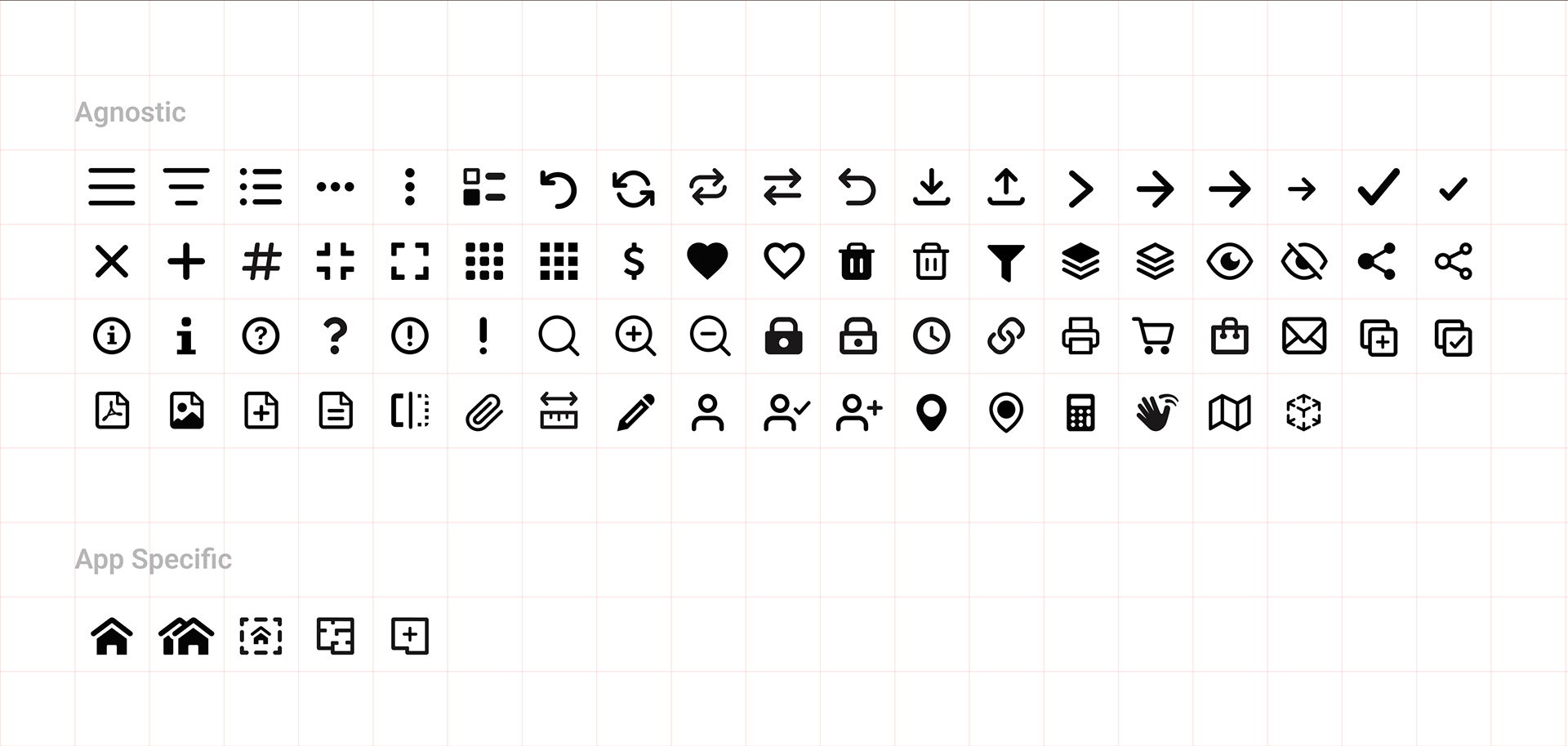
Figma component library icon set preview. I always use a grid for visually balancing my icon sets.
The Why
MediaLab decided to vastly improve both current and upcoming products with consistent mobile-first UI/UX, scalability, and consistency. The term "user-centered design" is thrown about a lot, but I firmly believe this is realistically achieved in iterative collaborative stages while focusing heavily on UI component patterns and consistencies. This is especially important when overhauling existing and/or creating new complex tools and applications over tightly budgeted periods of time. Any level of "design system" naturally achieves this, thus saving time and money.
Another challenging "why" is that this component library needed to work for current and future products that cross over into different industries. MediaLab focused heavily on the residential home building industry and then reached into various other industries like custom furniture, boats, shower doors, appliances, etc. The one big thing they all have in common is providing some level of viewing and selecting configurable packages and options. This meant I needed to create a fully responsive configurable menu system that is extremely content-flexible while keeping the darn product in view while the user interacts with it. At the end of the day, I feel pretty good about what I came up with. This menu system is now being used in both the 3D product configurator and the very new "home configurator", and is soon to be used with existing interior visualizers.
As you can see (and hopefully painfully read), this isn't a full-blown fancy design system, as it's more of a design component system that originated by creating it in XD and Figma, then in-house developers worked them into React and Angular frameworks as working and reusable components. Even this level of a system made a massive difference moving forward for MediaLab, its clients, and most importantly, end users.