
Home Builder Sales Center Presentation
Ideation // Client Interviews // UI/UX // Prototyping & Testing // Front-end HTML/CSS
The What
The purpose of this presentation is to assist on-site sales for residential home builders. It was redesigned from the ground up while also being integrated into a newly developed content management system (which was also ideated by myself and my fellow master project manager). The UI/UX is optimized and tested for large-format touchscreen televisions that are placed in new community sales centers. These are meant to be presented in person by a sales consultant to potential homebuyers.
The Why
The product this replaced was... just bad. It was also 100% custom development dependent. MediaLab contracted the old one to a company that wasn't close to the residential home-building industry. Enter me being hired directly and working as MediaLab's sole in-house UI/UX one-man-band. Then I had the privilege of working directly with their best project manager, and what came of this union was a vastly improved, dynamic redesign where almost every ounce of the content and basic front-end design elements could be managed and updated by both internal employees and external clients. The CMS for this product was also designed by me, and developed alongside the application itself. Does the final design belong on some fancy digital awards website, probably not, but we turned what was a dying product into the glue that held many of MediaLab's existing builder products together while saving both time and money. The CMS made making changes and updates a lot faster and easier for everyone involved. Well, until that started getting old and builders started asking for the future (enter the Home Configurator, which is in full working MVP with expanded CMS integrations). Progress and change never waited for anyone, but I embrace its constant challenge. Keeps me from getting bored.
Live Example
Mattamy Homes, Parkview at Long Lake Ranch
Link: https://myscp.ml3ds-icon.com/scp/85690/home
(The larger your screen, the better as this was never meant to work on tiny ones)
(The larger your screen, the better as this was never meant to work on tiny ones)
Example screens of this live presentation are in the gallery below. You'll notice some differences from the prototype walkthrough above, mainly with the main navigation always living at the bottom. This was an option that was designed and implemented through client testing and change iterations. This resulted in letting a user select between two different styles of navigation with the check of a box in the CMS. They also asked for other small additions that were custom to them, but overall they used the settings that were built into the application to help with branding consistency. For example, the CMS lets you customize colors (including hover/active states), set buttons and modals to have rounded corners, update images, and have custom default settings for client, division, and neighborhood levels.
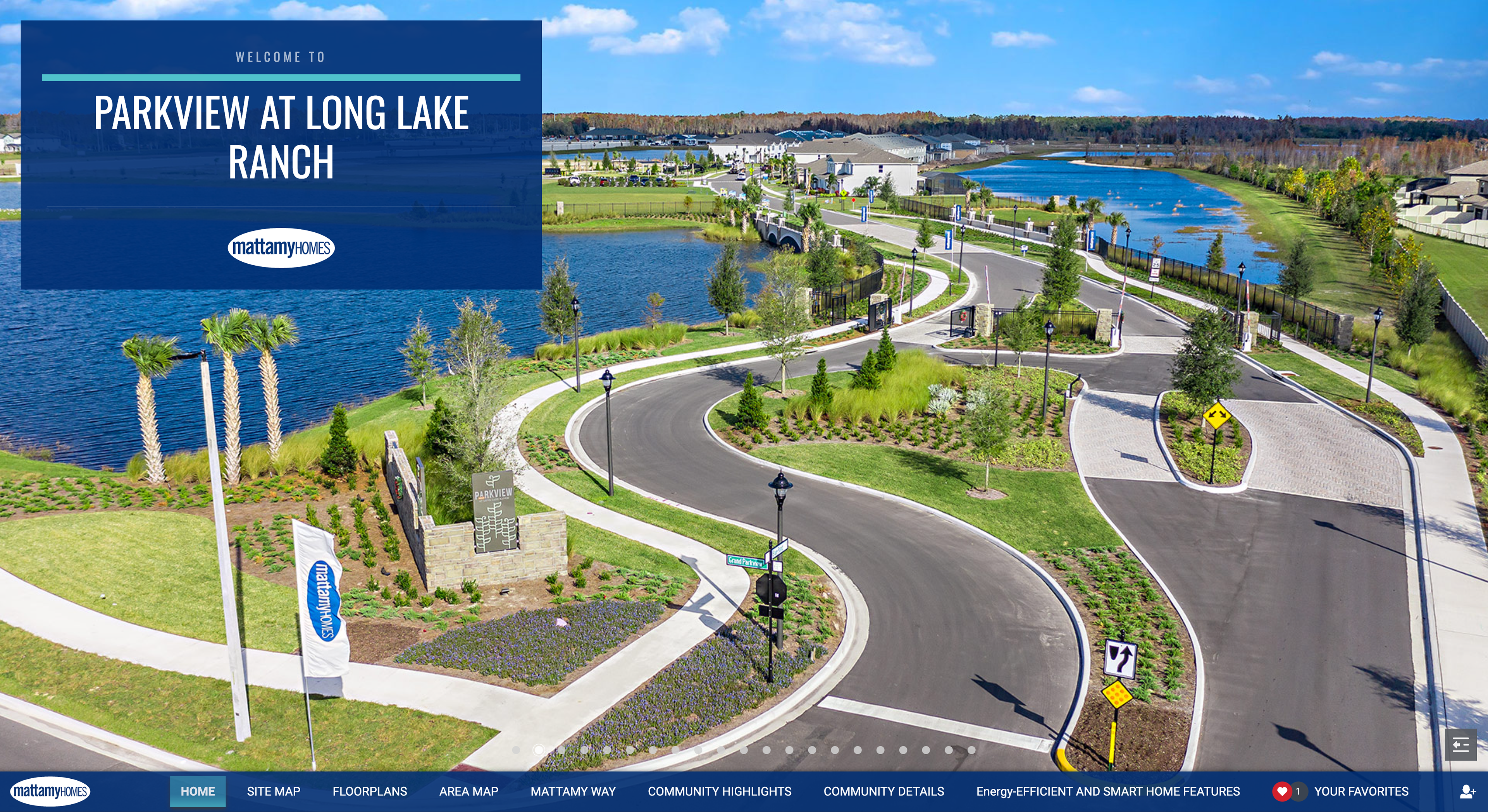
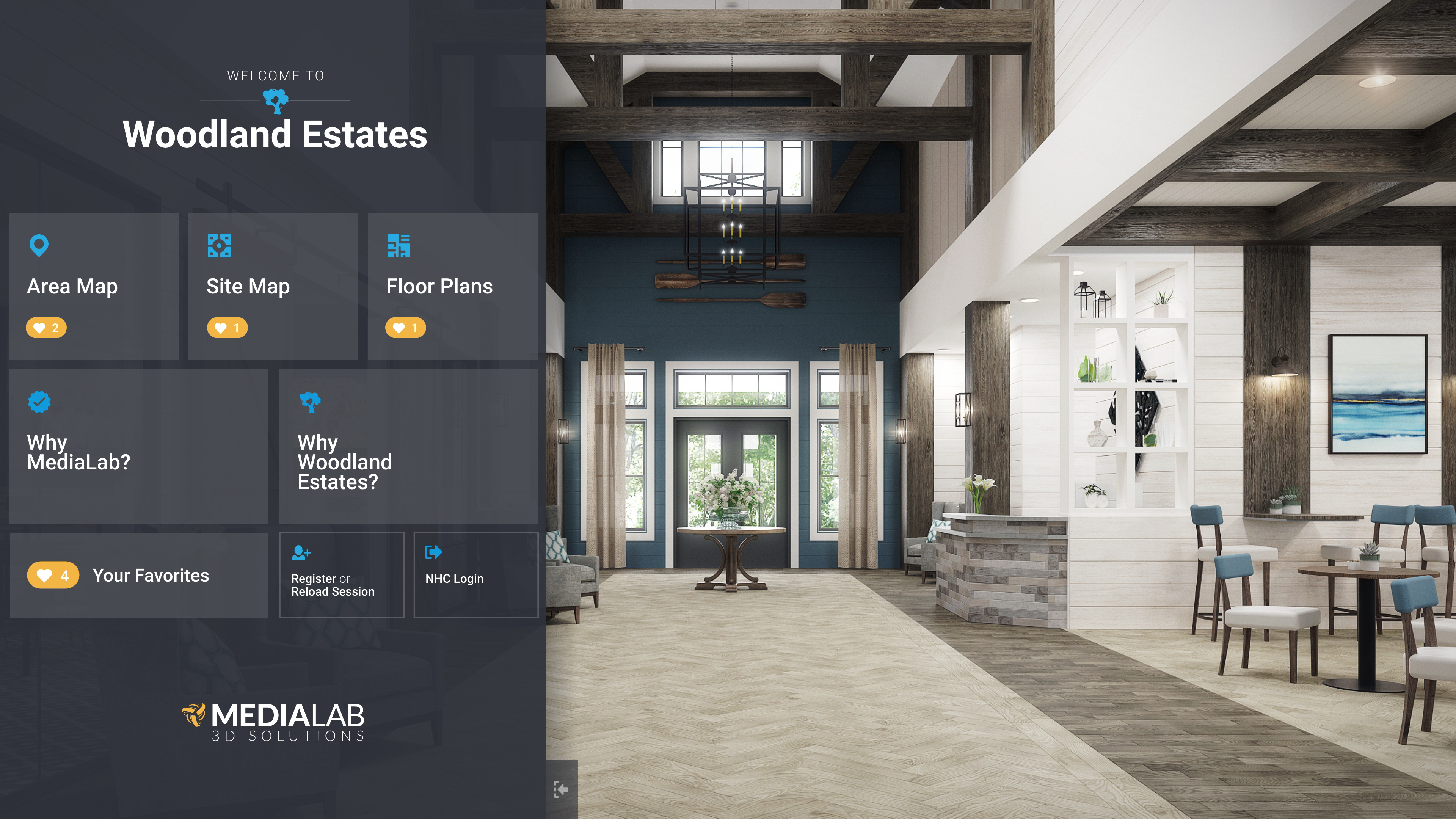
Home Screen
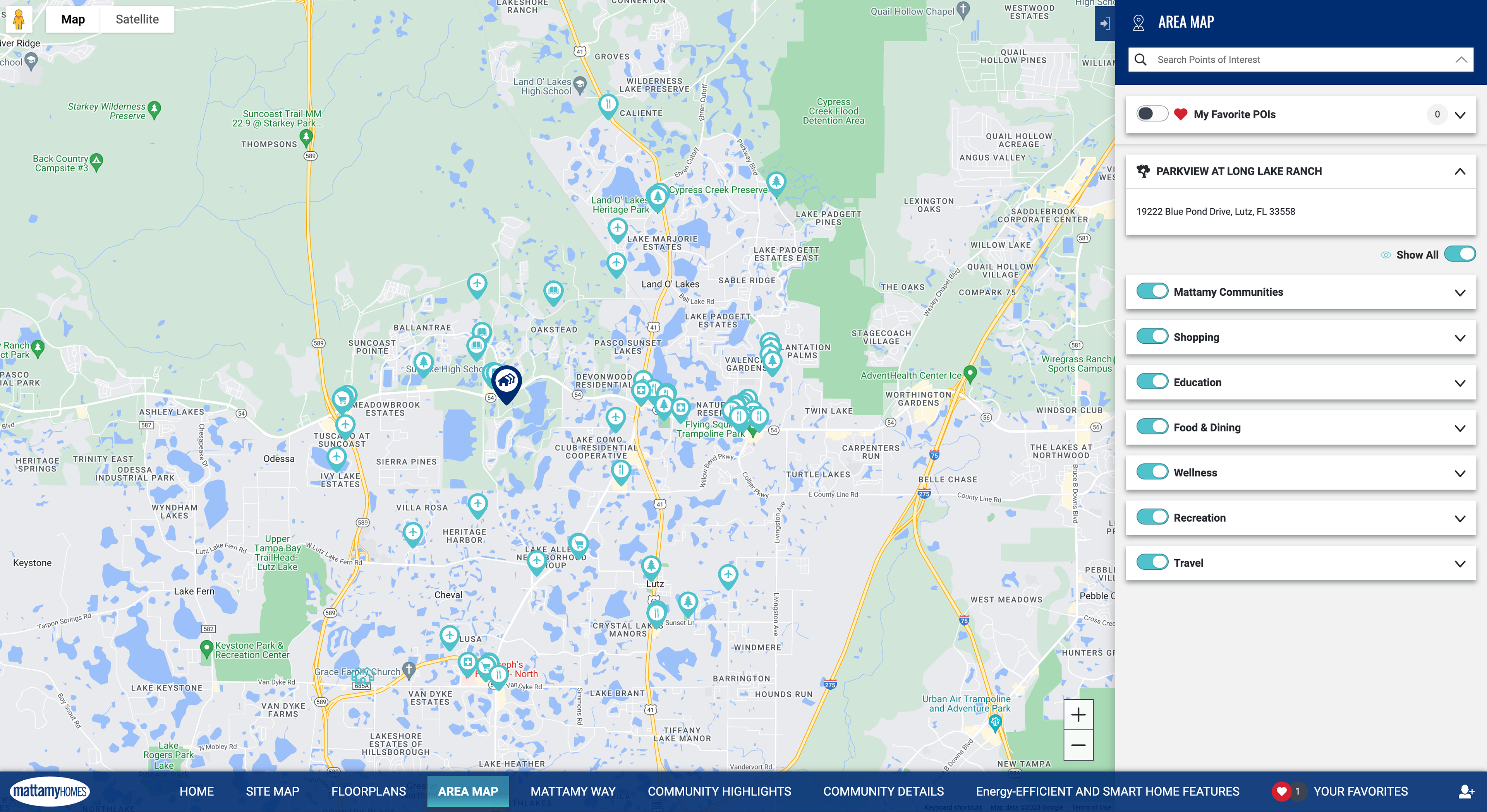
Area Map
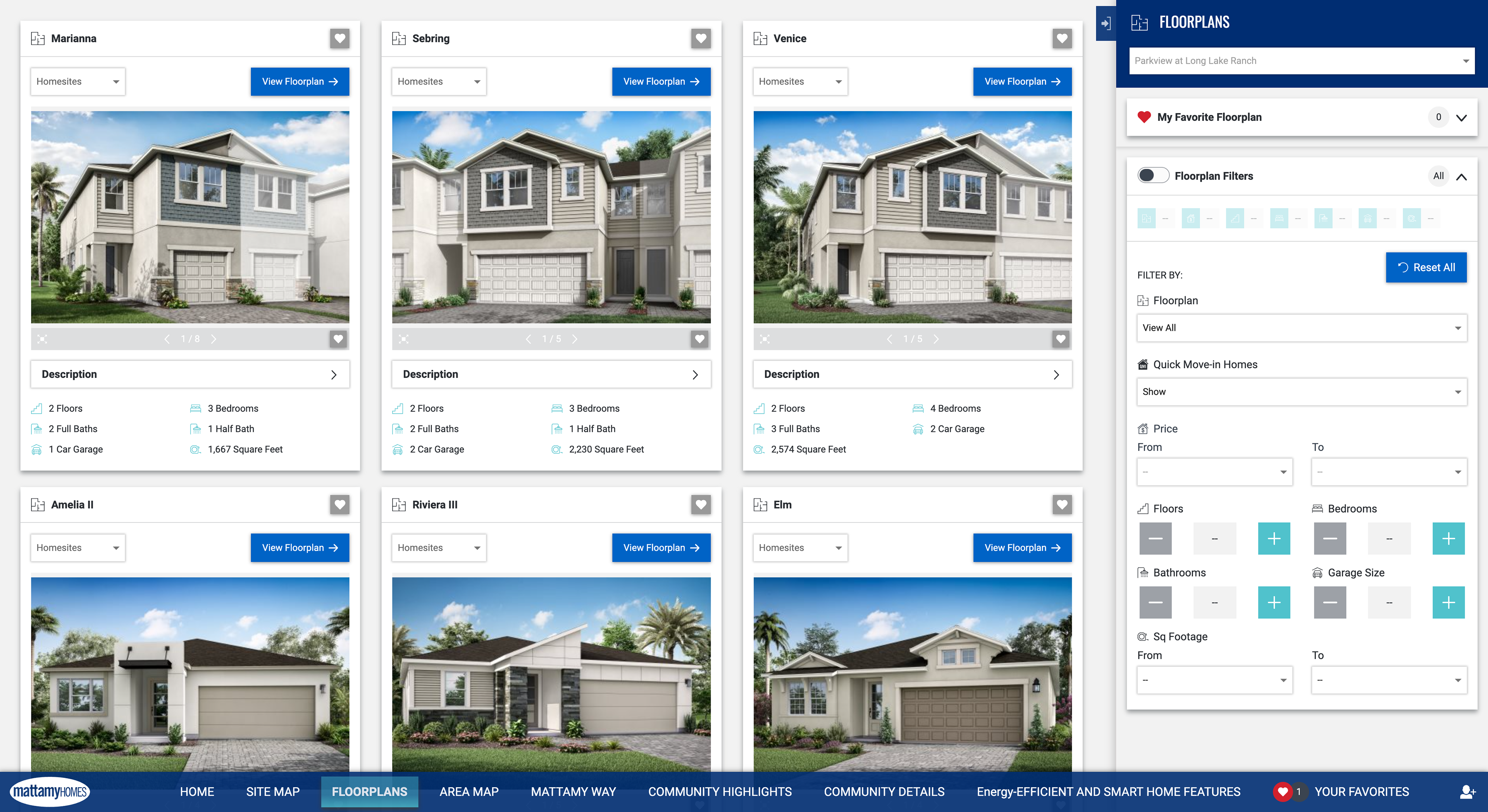
Floor Plan List
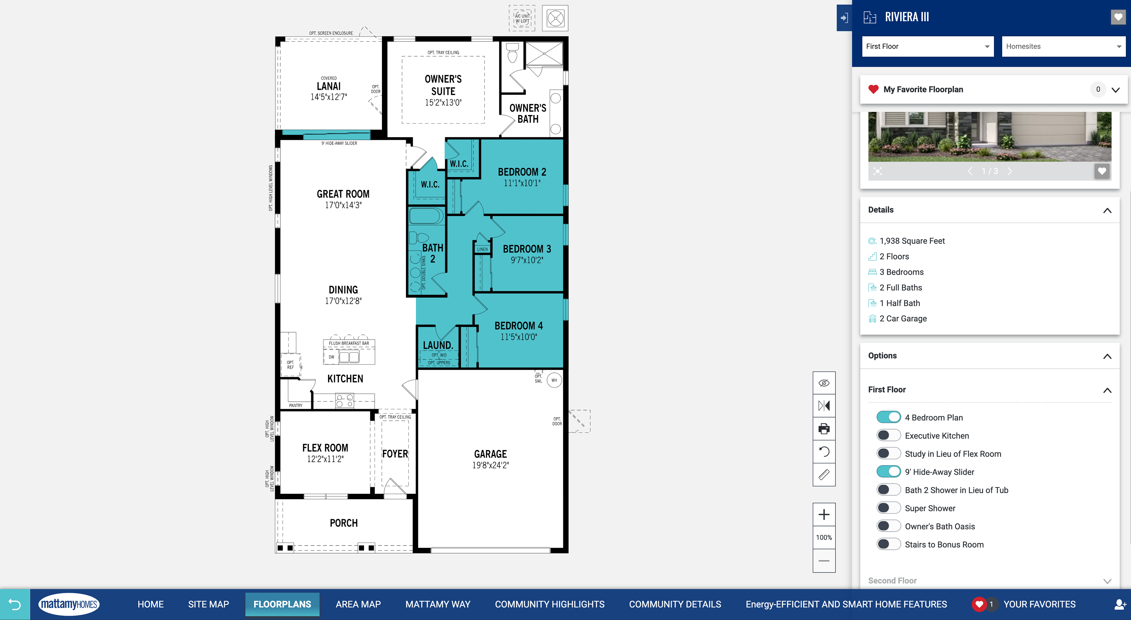
Interactive Floor Plan
Some Extra Stuff
The gallery below features some other interesting pieces to this puzzle. Each gallery image has a caption to help you contextualize, with one of the more interesting images being a sneak peek into the Converge (CMS) side of this. Converge is very robust and proprietary, so I needed to be careful showing too much more than what you see in the gallery.
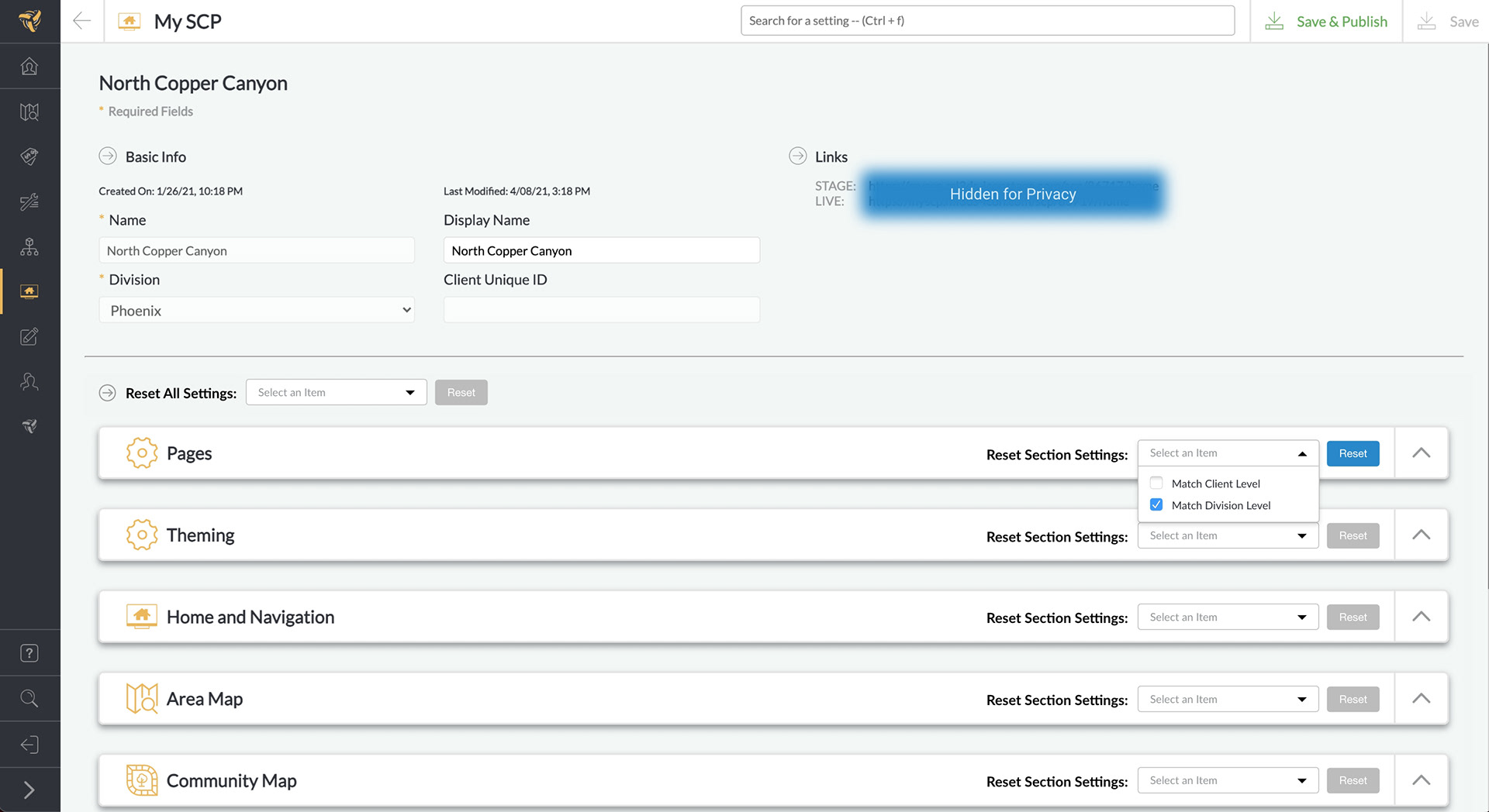
Converge CMS Sneek Peek
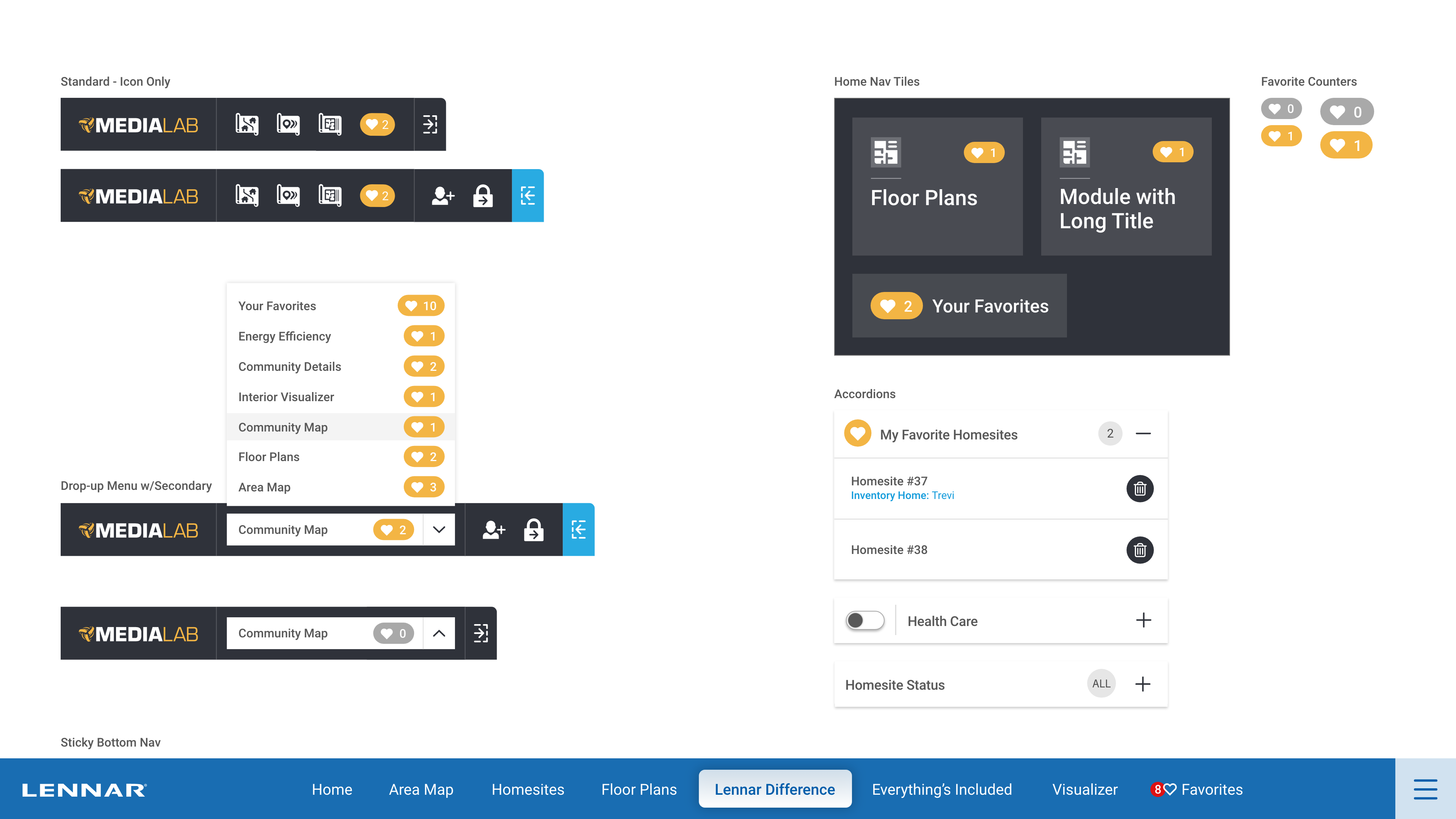
Prototype Components Preview
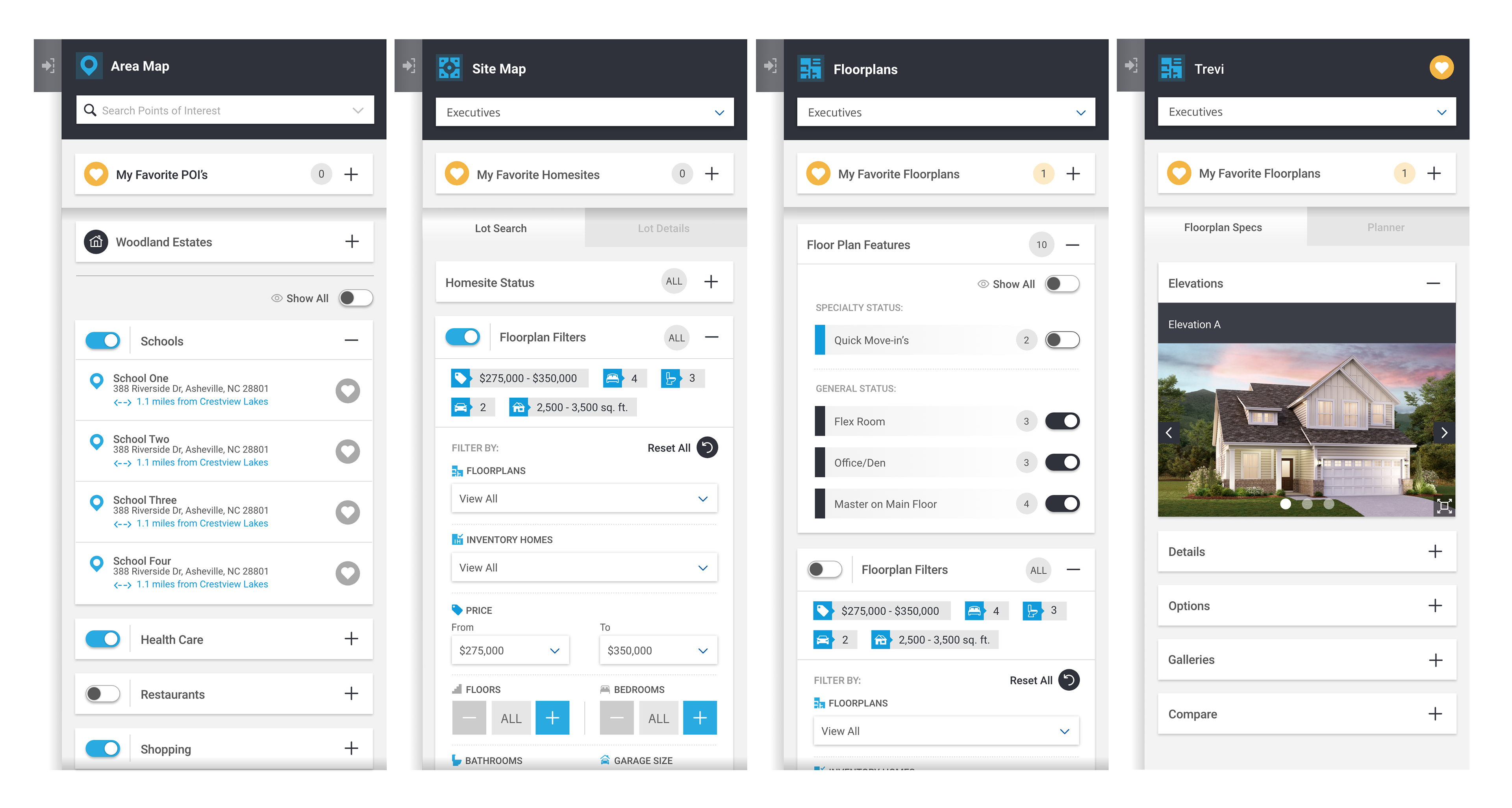
Prototype Sidebar Component Preview